Introduction to Writing Task 1 Bar Charts
In the IELTS Academic Writing Task 1, bar charts are among the most frequently used visuals. They test your ability to summarise, compare, and describe data accurately without giving personal opinions.
This IELTS Writing guide will explore IELTS bar chart samples at Band 7 and above, break down effective writing structures, and provide model answers with vocabulary support. By the end, you will know how to tackle bar chart questions confidently and boost your IELTS Writing Task 1 score. Let's get started!
Free IELTS Band 7→8 Toolkit
Practical Templates & Study Plan
Stuck at band 6.5-7? Download the free toolkit used by serious IELTS learner to improve structure, grammar, vocabulary, and task response in just 4 weeks.
Download Free ToolkitNo spam. Unsubscribe anytime.

How to Approach IELTS Bar Charts
Before looking at examples, follow this process:
- Analyse the chart – Look at the axes, categories, and units of measurement.
- Identify main features – Find the highest, lowest, similarities, and contrasts.
- Write an overview – Summarise general trends or comparisons without numbers.
- Provide details – Present key data in logical paragraphs.
- Use a wide range of grammar and vocabulary – Avoid repetition, vary sentence structures.
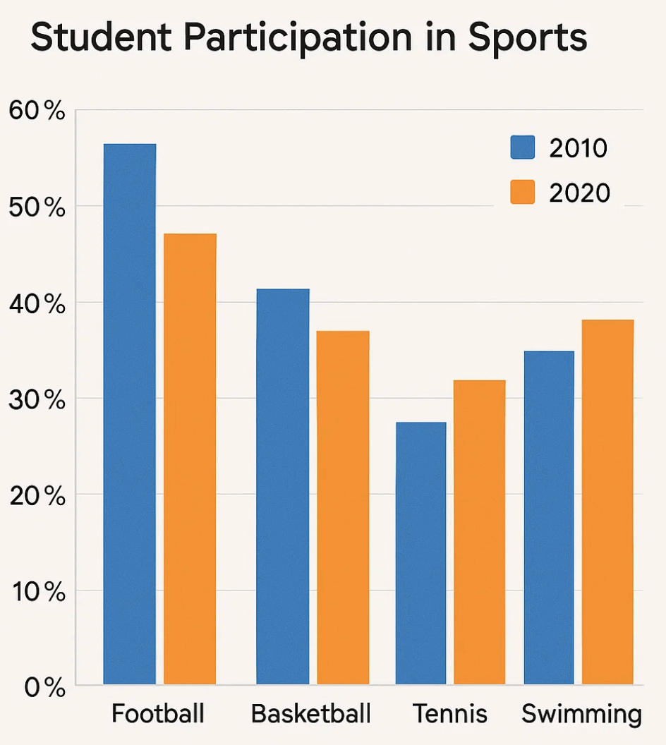
Bar Chart Sample 1: Student Participation in Sports
Task: The bar chart shows the percentage of students in Country X who participated in football, basketball, tennis, and swimming in 2010 and 2020.
Model Answer (Band 8)
Introduction
The bar chart illustrates the proportion of students engaging in four sports—football, basketball, tennis, and swimming—in Country X in 2010 and 2020.
Overview
Overall, football remained the most popular sport, although participation decreased slightly, while swimming showed the most significant growth.
Details (Paragraph 1)
In 2010, around 60% of students played football, compared with 40% for basketball, 25% for tennis, and 20% for swimming. By 2020, football dropped to about 50%, while basketball declined slightly to 35%.
Details (Paragraph 2)
In contrast, swimming more than doubled, rising to nearly 45%, overtaking tennis, which increased modestly to 30%. The gap between football and swimming narrowed considerably, reflecting a shift in preferences.
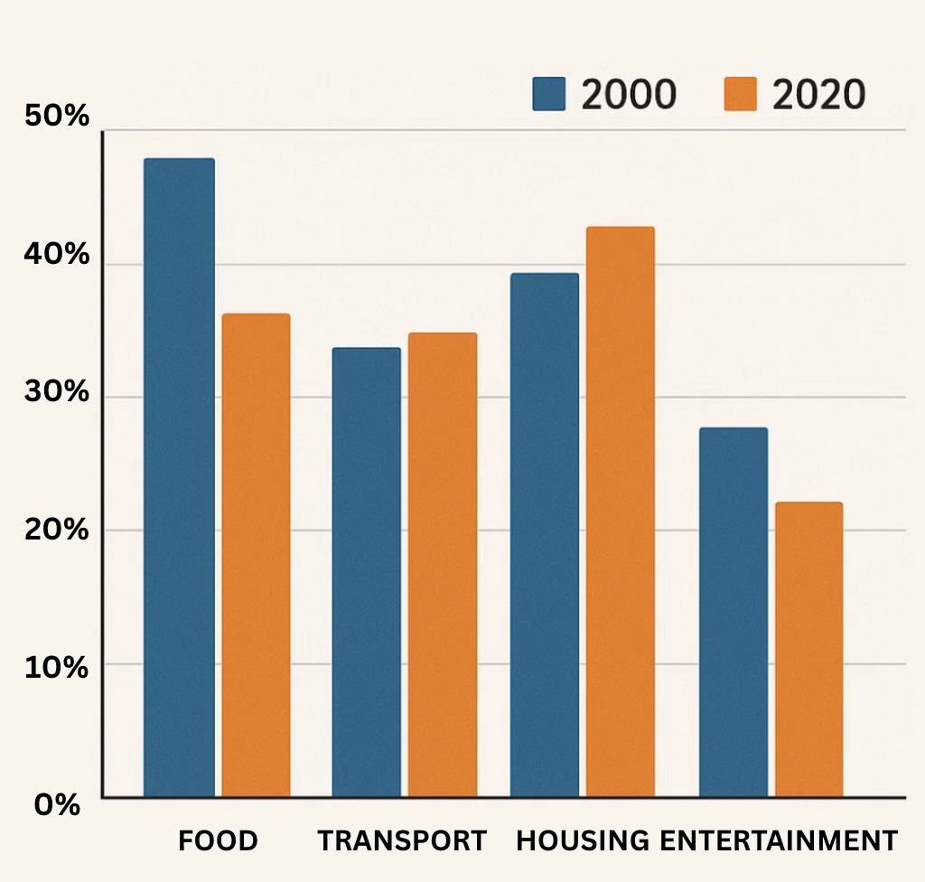
Bar Chart Sample 2: Household Expenditure
Task: The chart compares household spending on food, transport, housing, and entertainment in 2000 and 2020 in Country Y.
Model Answer (Band 7.5)
Introduction
The bar chart compares the percentage of household income spent on four categories—food, transport, housing, and entertainment—in Country Y in 2000 and 2020.
Overview
Overall, spending on housing and transport increased, while food and entertainment saw declines.
Details (Paragraph 1)
In 2000, housing accounted for the largest share at almost 40%, followed closely by food at 36%, transport at 34%, and entertainment at just under 30%. By 2020, food dropped to 36% and entertainment decreased to slightly above 20%.
Details (Paragraph 2)
Conversely, housing rose to over 40%, and transport to around 35%. This indicates a shift in household priorities towards essential costs.
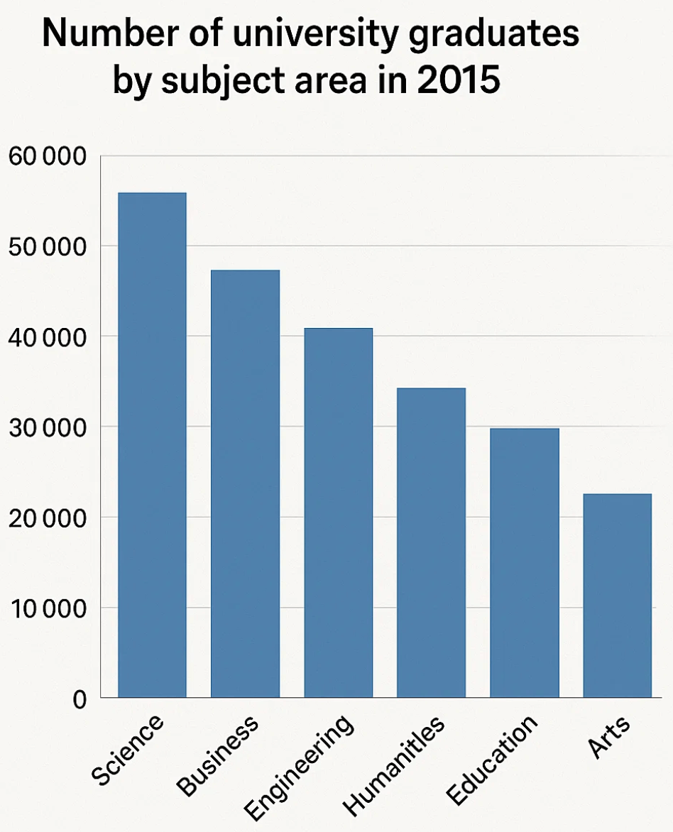
Bar Chart Sample 3: University Graduates by Subject
Task: The bar chart displays the number of university graduates in Country Z by subject area in 2015.
Model Answer (Band 9)
Introduction
The bar chart illustrates graduate numbers in various subject areas in Country Z in 2015.
Overview
Overall, science and business-related degrees were most popular, while arts had the fewest graduates.
Details (Paragraph 1)
Science produced the highest number of graduates at around 60,000, followed by business at almost 50,000. Engineering ranked third at approximately 40,000.
Details (Paragraph 2)
Subjects such as humanities (35,000) and education (30,000) had lower figures, while arts came last with just over 20,000 graduates. The gap between science and arts was substantial.
Useful Vocabulary for Bar Charts
- High/low values: the highest proportion, the lowest figure, the majority, the minority
- Comparison language: larger than, smaller than, outnumbered, accounted for
- Changes: increased, decreased, rose, fell, dropped, grew
- Adverbs: significantly, slightly, dramatically, steadily
Common Mistakes in IELTS Bar Chart Descriptions
- Listing numbers only – Always group data logically.
- Forgetting the overview – The second paragraph must summarise trends.
- Incorrect tenses – Use past tense if data is from past years.
- Overusing “increase/decrease” – Use synonyms to show range.
- Adding opinions – Task 1 requires objective description, not analysis.
Conclusion
Bar charts in IELTS Writing Task 1 allow examiners to assess how well you compare and summarise data. By providing clear overviews, grouping information logically, and using a wide vocabulary, you can achieve Band 7 or higher.
👉 Explore more IELTS Writing guides for pie charts, line graphs, and process diagrams to strengthen your Task 1 preparation, or visit the IELTS Hub page.
Glossary
- Proportion (noun): part or share of a whole.
- Category (noun): a group or type in data presentation.
- Axis (noun): the horizontal or vertical line showing scale.
- Trend (noun): the general direction of change.
- Fluctuation (noun): continuous rise and fall in data.
Practise What You Learned
Questions
- What is the main purpose of Writing Task 1 in IELTS?
- Which tense should be used if the bar chart shows data from 2000?
- Fill in the blank: “Entertainment spending ______ from 10% to 8%.”
- True/False: You should always give your opinion in Task 1 answers.
- Which two sports changed the most in Sample 1?
Answers
- To summarise and compare data objectively.
- Past tense.
- decreased / fell / dropped.
- False.
- Football (decreased) and swimming (increased).
Free IELTS Band 7→8 Toolkit
Practical Templates & Study Plan
Stuck at band 6.5-7? Download the free toolkit used by serious IELTS learner to improve structure, grammar, vocabulary, and task response in just 4 weeks.
Download Free ToolkitNo spam. Unsubscribe anytime.