Introduction to Writing Task 1 Line Graphs
Line graphs are one of the most common visuals you may face in IELTS Academic Writing Task 1. They test your ability to describe trends over time, compare data, and highlight significant changes.
This guide provides multiple IELTS line graph examples with step-by-step sample answers, useful vocabulary, and clear explanations.
By the end, you will know exactly how to structure your response and use the right academic language.
Free IELTS Band 7→8 Toolkit
Practical Templates & Study Plan
Stuck at band 6.5-7? Download the free toolkit used by serious IELTS learner to improve structure, grammar, vocabulary, and task response in just 4 weeks.
Download Free ToolkitNo spam. Unsubscribe anytime.
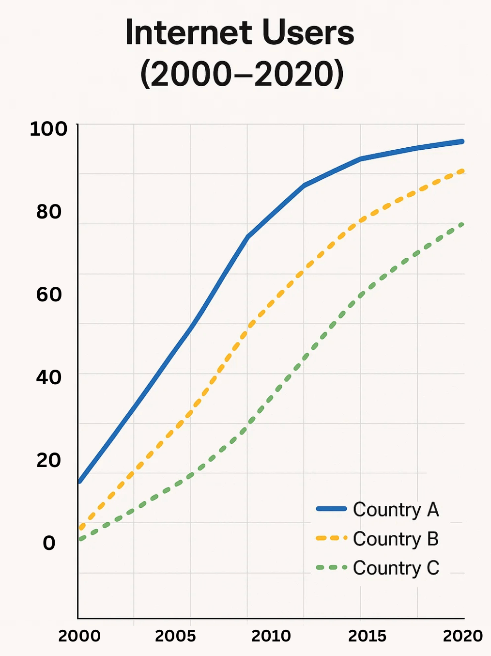
Sample 1: Line Graph of Internet Users (2000–2020)
Task: The line graph shows the percentage of households with internet access in three countries between 2000 and 2020.
Introduction (Paraphrase)
The line graph compares internet penetration among households in Country A, Country B, and Country C from 2000 to 2020.
Overview
Overall, internet access increased significantly in all three countries, with Country A reaching near universal coverage, while Country C consistently lagged behind.
Details (Paragraph 1)
In 2000, internet access was relatively low: around 10% in Country A, 5% in Country B, and virtually zero in Country C. By 2010, both Countries A and B had grown sharply, reaching approximately 70% and 60% respectively. Country C, however, only reached 20%.
Details (Paragraph 2)
Between 2010 and 2020, growth continued in all three nations. Country A peaked at nearly 100% by 2020, Country B reached 85%, while Country C climbed steadily to around 60%. The gap between Country A and C remained substantial throughout.
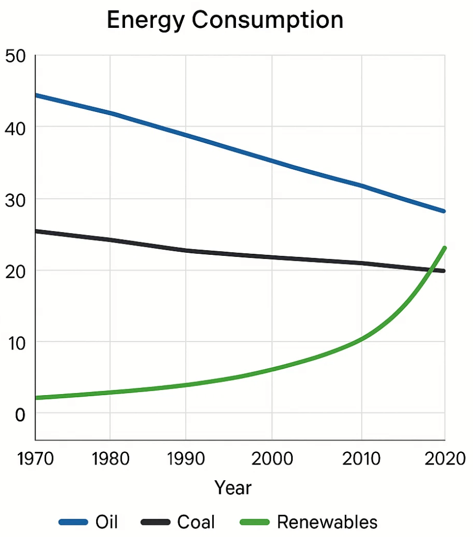
Sample 2: Energy Consumption (1970–2020)
Task: The graph illustrates energy consumption by oil, coal, and renewables between 1970 and 2020.
Introduction
The line graph shows changes in energy consumption from three major sources—oil, coal, and renewables—over a fifty-year period.
Overview
Overall, while oil remained the most used energy source, its share declined steadily, whereas renewable energy showed continuous growth, particularly after 2000.
Details (Paragraph 1)
In 1970, oil accounted for about 50 units of consumption, compared with 30 for coal and only 5 for renewables. Over the next three decades, oil consumption decreased gradually, reaching 40 units by 2000. Coal usage remained stable at roughly 30, while renewables saw modest growth to 10.
Details (Paragraph 2)
After 2000, the gap narrowed. Oil fell further to 30 by 2020, coal declined slightly to 25, but renewables surged to 20, representing the fastest growth. This indicates a shift towards cleaner energy sources.
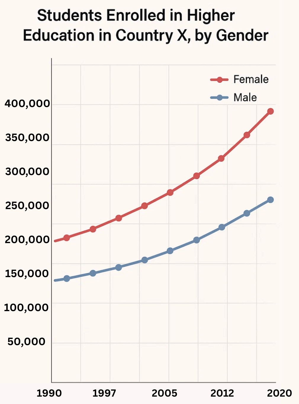
Sample 3: Student Enrolment in Higher Education
Task: The line graph shows the number of students enrolled in higher education in Country X by gender between 1990 and 2020.
Introduction
The line graph depicts university enrolments among men and women in Country X over a thirty-year period.
Overview
Overall, total enrolments increased, with women consistently outnumbering men. The gender gap widened over time.
Details (Paragraph 1)
In 1990, there were around 200,000 female students compared with 180,000 male students. By 2000, both figures rose steadily to 250,000 and 220,000 respectively.
Details (Paragraph 2)
Growth accelerated after 2000, particularly for women, whose numbers surpassed 400,000 by 2020. Male enrolments also increased, reaching 300,000, but the gap between the two genders reached over 100,000.
Useful Vocabulary for Line Graphs
- Upward trends: increase, rise, climb, grow, soar, peak
- Downward trends: decrease, fall, drop, decline, plummet
- Stable/no change: remain steady, stabilise, plateau, level off
- Comparisons: higher than, lower than, surpass, lag behind, outnumber
- Adverbs for precision: sharply, gradually, significantly, slightly, steadily
Common Mistakes in IELTS Line Graphs
- Listing numbers without overview: Always write a clear trend summary.
- Ignoring time expressions: Use between 2000 and 2010, over the next decade, by 2020.
- Misusing tenses: Use the past tense if the period is finished.
- Overusing “increase/decrease”: Vary your vocabulary.
- Adding opinions: Task 1 requires objective description only.
Conclusion
Describing IELTS Writing Task 1 line graphs requires attention to detail, clear organisation, and precise academic vocabulary. Remember to provide an overview, select key features, and avoid unnecessary details. Practising with different graphs will strengthen your ability to adapt on test day.
👉 Continue learning more model answers for bar charts, pie charts, and process diagrams.
Glossary
- Trend (noun): a general direction of change (increase, decrease, stable).
- Axis (noun): the horizontal or vertical line on a graph showing scale.
- Fluctuation (noun): continuous rise and fall.
- Overview (noun): a short summary of the main features.
- Plateau (noun/verb): a period where growth stops and levels out.
Comprehension Practice
Questions
- What must you always include in your Task 1 answer?
a) Your personal opinion
b) An overview of the main trends - Which tense do you use for graphs showing past years (e.g., 1990–2010)?
- Fill in the blank: “The number of users ______ sharply between 2015 and 2020.”
- True/False: You should describe every number in the graph.
- Name two adverbs you can use to describe change.
Answers
- b
- Past tense
- increased / rose / grew
- False
- sharply, gradually (or significantly, slightly, steadily)
Join over 800+ learners
Join the community for free resources and other learning opportunities.
No spam — only valuable English learning content.